 |
Weather Eye with John Maunder |
A superimposed graph of five global monthly temperatures January 1979 to October 2014 is shown below.
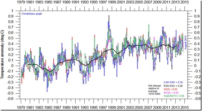
As the base period differs for the individual temperature estimates, they have all been normalised by comparing with the average value of the initial 120 months (10 years) from January 1979 to December 1988.
The heavy black line represents the simple running 37 month (c. 3 year) mean of the average of all five temperature records. The numbers shown in the lower right corner represent the temperature anomaly relative to the individual 1979-1988 averages.
It should be kept in mind that satellite and surface-based temperature estimates are derived from different types of measurements, and that comparing them directly as done in the diagram above therefore may be somewhat problematical.
However, the different types of temperature estimates appear to agree quite well as to the overall temperature variations on a two-three year scale, although on a shorter time scale there are often considerable differences between the individual records.
All five global temperature estimates presently show a general overall stagnation, at least since 2002. There has been no real increase in global air temperature since 1998, which was affected by the oceanographic El Niño event.
This stagnation does not exclude the possibility that global temperatures will begin to increase again later. On the other hand, it also remain a possibility that Earth just now is passing a temperature peak, and that global temperatures will begin to decrease during the coming years.
Time will show which of these two possibilities is correct.
Below is a link which will take you directly to a monthly newsletter with global meteorological information updated to October/November 2014.
http://www.climate4you.com/Text/Climate4you_November_2014.pdf
The website is produced by Ole Humlum, Professor of Physical Geography, Institute of Geosciences, University of Oslo.