 |
Weather Eye with John Maunder |
Much has been written about what is happening to the global climate.
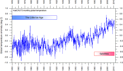
The following diagram shows the trends in global surface temperatures during the 160 years from 1850.
The graph shows a cooling from 1880 to 1895, a warming from 1915 to 1945, a cooling from 1945 to 1950, a warming from 1965 to 2000 – and stable temperatures since 2000.
Global monthly average surface air temperature since 1850 – according to Hadley CRUT, a cooperative effort between the Hadley Centre for Climate Prediction and Research and the University of East Anglia's Climatic Research Unit (CRU) in the UK – sees the blue line represent the monthly values.
An introduction to the dataset has been published by Brohan et al. (2005). The base period is: 1961-1990. And, the last month shown is: December 2010. The diagram was last updated January 3, 2011.
For further information, please go to: https://sites.google.com/site/climatediceandthebutterfly/