|
Weather Eye with John Maunder |
Professor Ole Humlum, of the Institute of Geosciences, University of Oslo, Norway, maintains a very comprehensive climate web site and much of this WeatherEye is from his website. See http://www.climate4you.com
A graph of five global monthly temperatures January 1979 to June/July 2016 is shown below.
The graph shows a superimposed plot of Quality Class 1 and Quality Class 2 and Quality Class 3 global monthly temperature estimates.
As the base period differs for the different temperature estimates, they have all been normalised by comparing to the average value of 30 years from January 1979 to December 2008.
The heavy black line represents the simple running 37 month mean of the average of all temperature records.
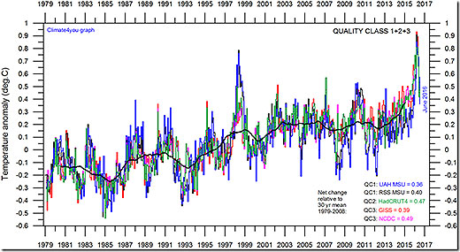
The numbers shown in the lower right corner represent the temperature anomaly relative to the individual 1979-1988 averages.
It should be kept in mind that satellite and surface-based temperature estimates are derived from different types of measurements, and comparing them directly as done in the diagram above therefore may be somewhat problematical.
However, the different types of temperature estimates appear to agree quite well as to the overall temperature variations on a two-three year scale, although on a shorter time scale there are often considerable differences between the individual records.
All five global temperature estimates presently show a general overall stagnation, at least since 2002.
However, there appears to be small increase (warming) during the last few years. The year 1998 and the current 2015/16 period was affected by the oceanographic El Nino event.
This stagnation doesn't exclude the possibility that global temperatures will begin to increase again later.
On the other hand, it also remains a possibility that Earth just now is passing a temperature peak, and global temperatures will begin to decrease during the coming years.
Time will show which of these two possibilities is correct.
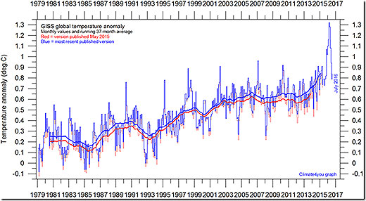
One of several key global temperature graphs is the monthly average surface air temperature calculated by the Goddard Institute for Space Studies, at Columbia University, New York City, USA.
The graph below is updated to July 2016. GISS is a laboratory of the Earth-Sun Exploration Division of NASA's Goddard Space Flight Center and a unit of the Columbia University Earth Institute.
The thick line is the simple running 37 month average, nearly corresponding to a running 3 year average.